CONTEXT
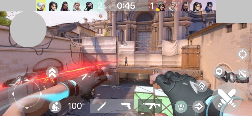
VALORANT is a 5v5 character-based tactical shooter created by Riot Games. At launch, it broke Twitch’s single-day viewership record with 34 million hours watched.
After a talk with Riot’s former Director of Engineering, I was encouraged to try and develop a design for a mobile adaptation in my own time. This case study led to my involvement in the real thing at Riot!
The problem
How might we adapt a mechanics-intensive PC shooter to a mobile format?
State of play
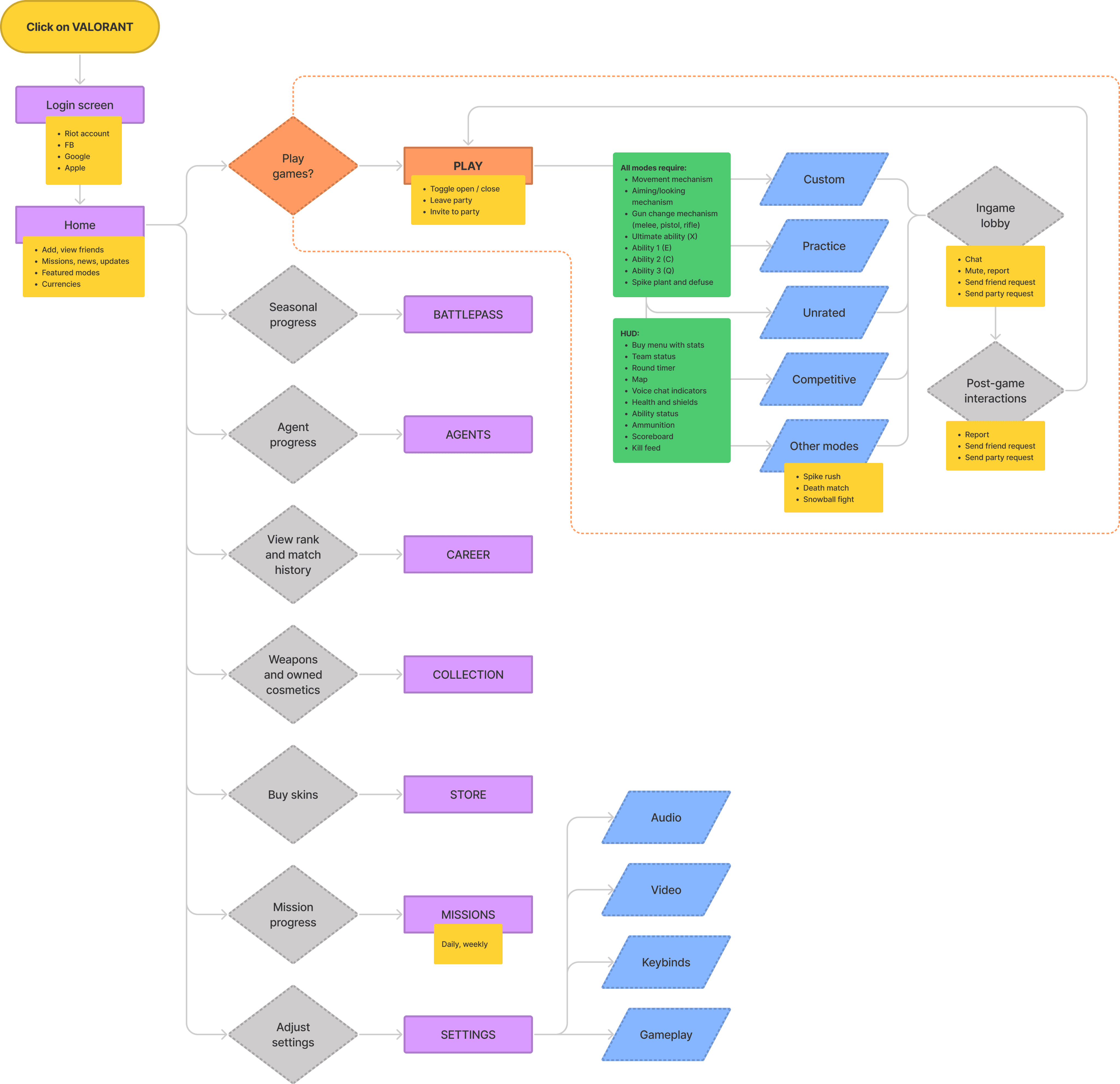
Unsurprisingly, VALORANT has lots of features and interactions.
A (simplified?) IA diagram of VALORANT's PC features
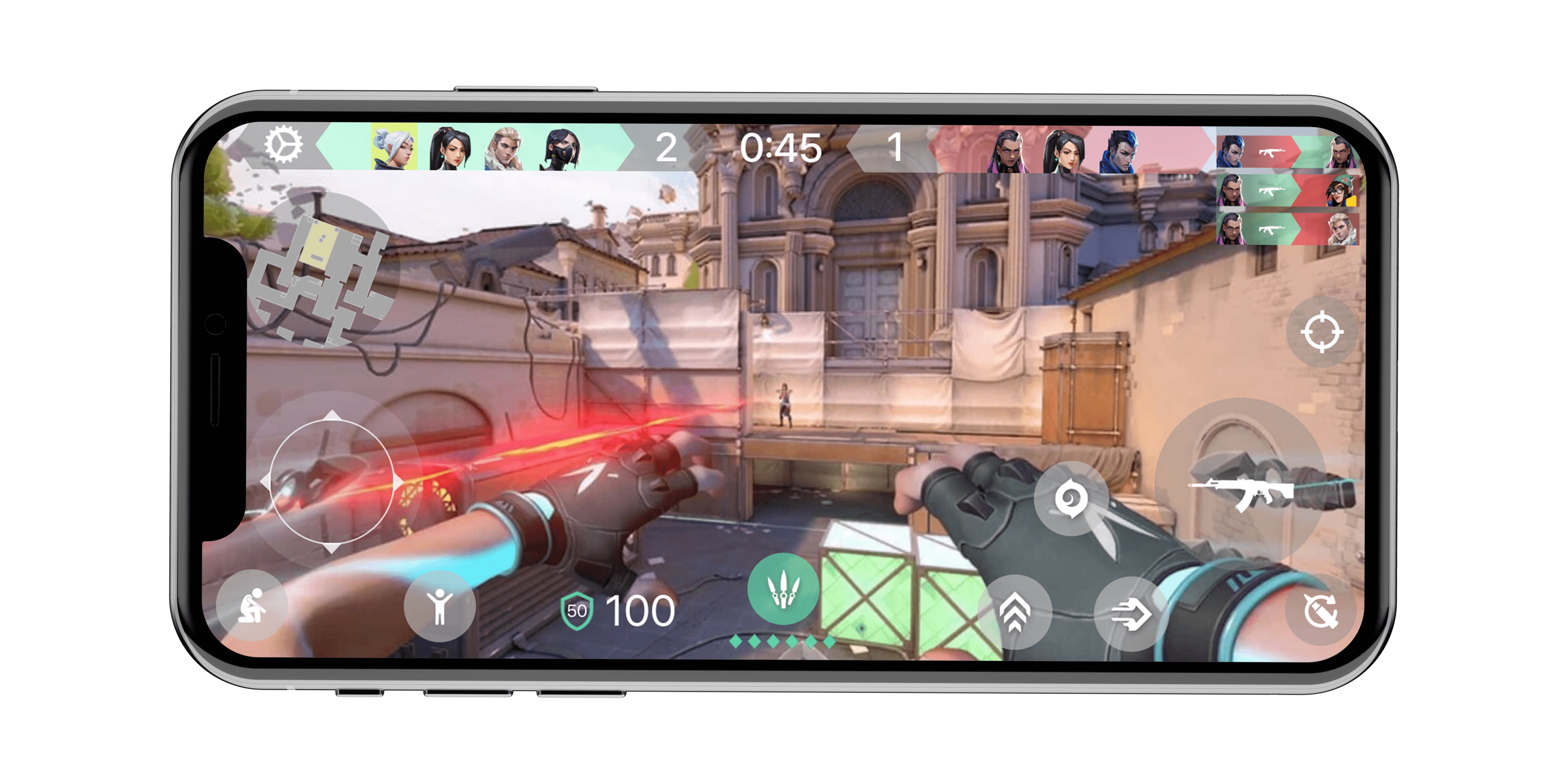
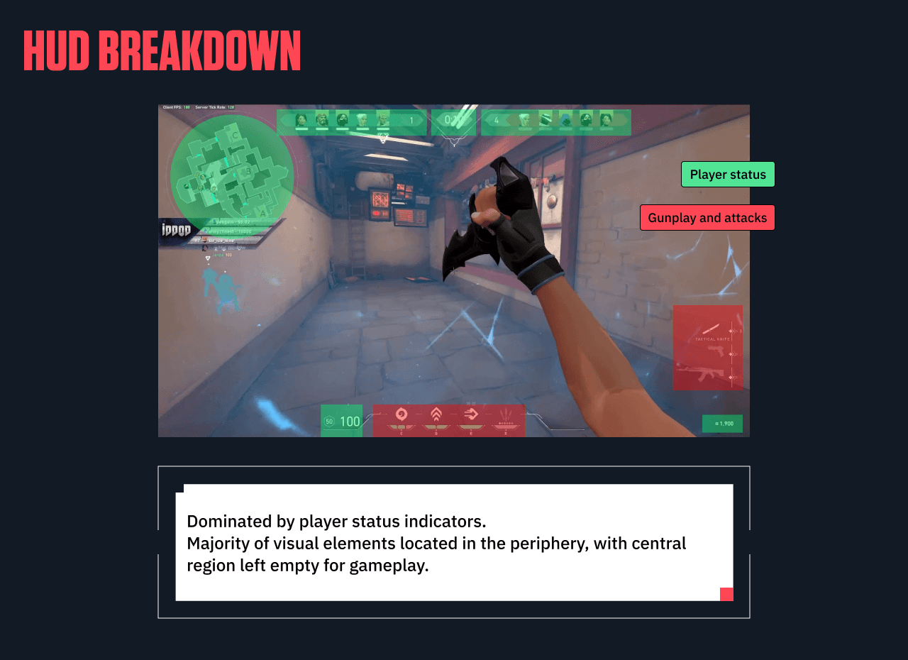
It was unlikely that I’d be able to fully “translate” all the features in the PC version to mobile, so I prioritized working on the in-game interface: the HUD, scoreboard, and buy screen accessible for players after they load into a game.
Existing interactions and inputs
In VALORANT, quick reactions and muscle memory are rewarded.
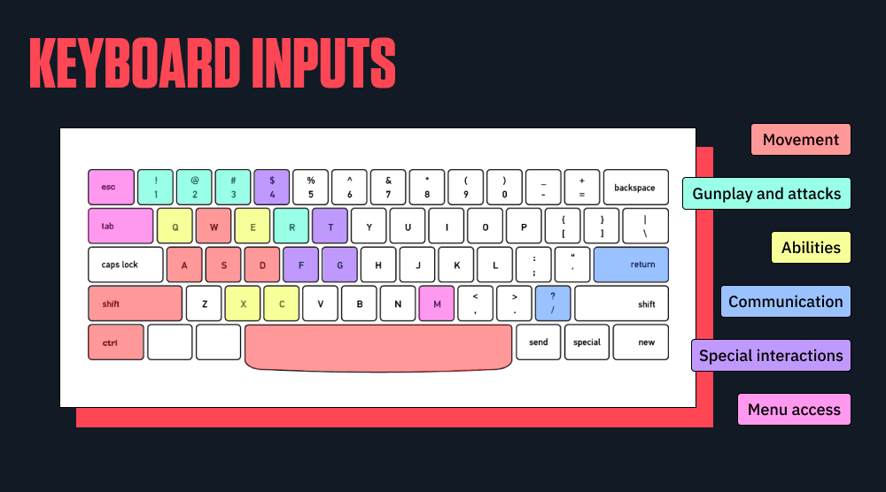
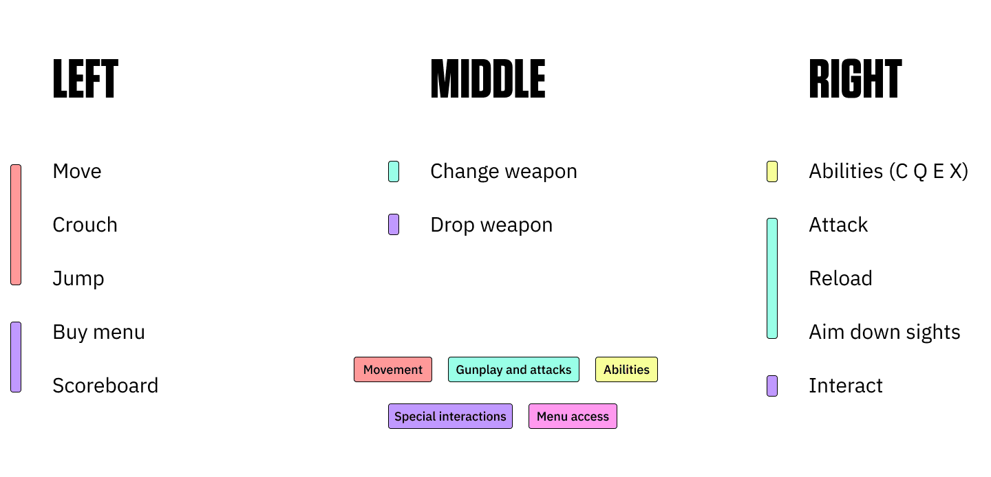
There are over 22 keys that users are able to interact with in-game. The majority are movement-based (crouch, jump, run), with a heavy skew towards the left side of the keyboard since users are expected to use mice with their right hand.
Special interactions, such as planting the spike and interacting with objects on the map, are also core parts of objective-focused gameplay.
Exploring mobile screen interactions
INTERACTION TESTS.
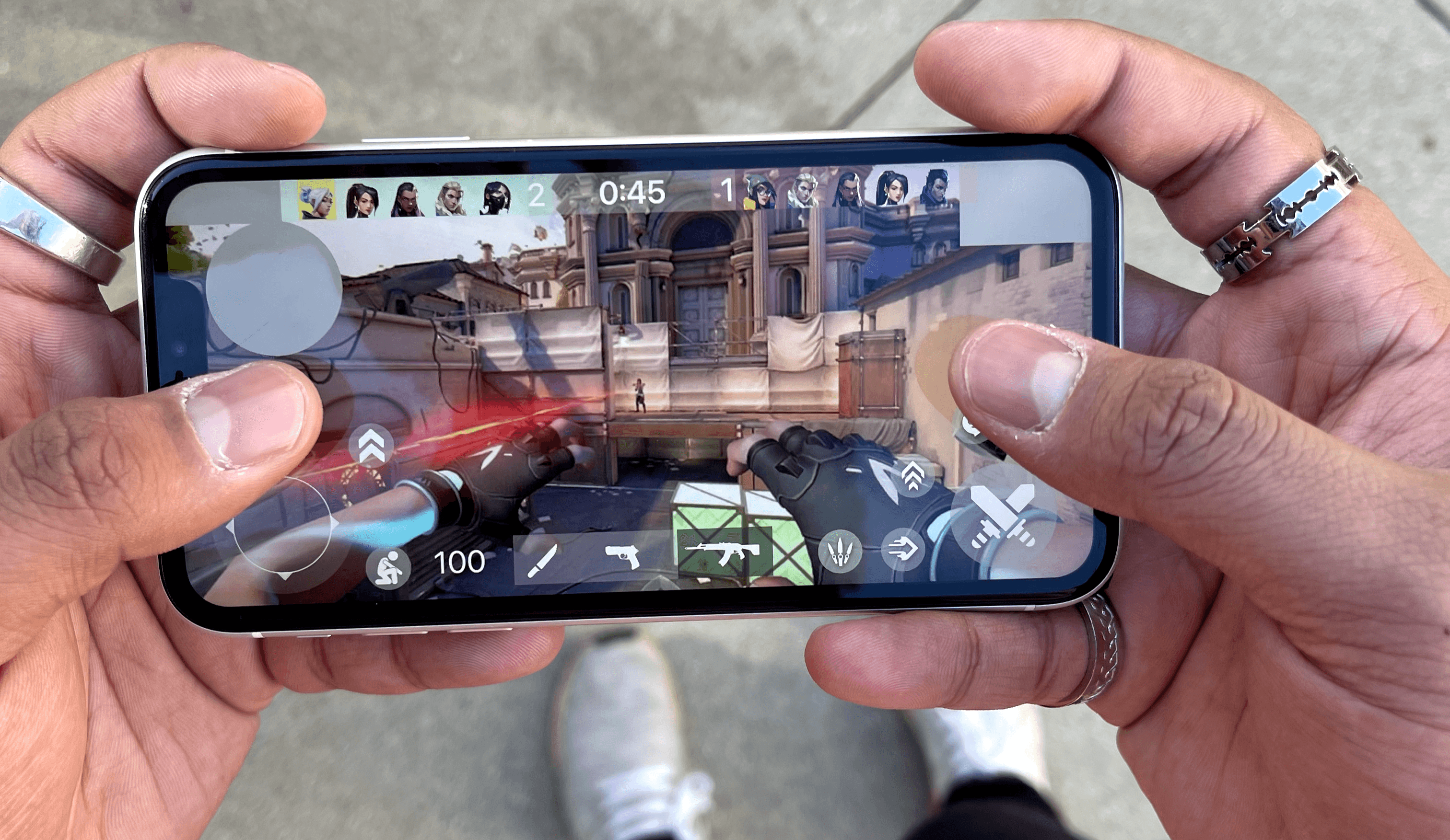
Observing how 10+ users naturally grip horizontal phones
USER INTERVIEWS.
Conducted with 8 players of varying experience
MARKET ANALYSIS.
How do other ported mobile games allocate screen space?
I started with my own reach and grip, and then observed 10 other users. I have particularly short thumbs (thanks, Dad), so I was only able to cover around maybe half to two thirds of the screen area.
Key takeaways
No index fingers
The majority of casual users felt uncomfortable bringing their index fingers down. It covers a lot of valuable screen space and requires a shift in grip that makes holding the phone less stable.
There is a natural arc
Key interactible elements such as shoot, move, etc. should therefore be in the "natural" arc that thumbs cover in a horizontal grip.
Thumb flex
It’s easier for thumbs to bend inward rather than stretch outward; frequently used buttons should be closer to the bottom corners and edges rather than the top.
With a rough idea of what the norm was for mobile grips, I moved on to player interviews.
Player interviews
Given the wide range of agents available in VALORANT, I wanted to better understand the variety of players’ playstyles and experiences.
The players I interviewed could be categorised based on their time spent in-game and their prior game experience.
THE Social players.
More casual with their time spent, valuing the social experience, learning collectively and largely playing with groups of friends. This group had the most experience with mobile games, but not necessarily mobile shooters.
THE Learners.
More recent to the FPS genre with less experience, valuing the satisfaction of making plays and getting kills. These players spoke about being influenced from Twitch streams, and prioritised their learning curve and agent mastery.
The veterans.
Those with 4+ years playing FPS or PC games in general placed heavy emphasis on pixel-perfect precision and immediate network feedback. Only one had ever played mobile shooters (Fortnite and PUBG Mobile), and all were sceptical about whether that sense of high-level skill could transfer to a mobile format.
Competitive analysis
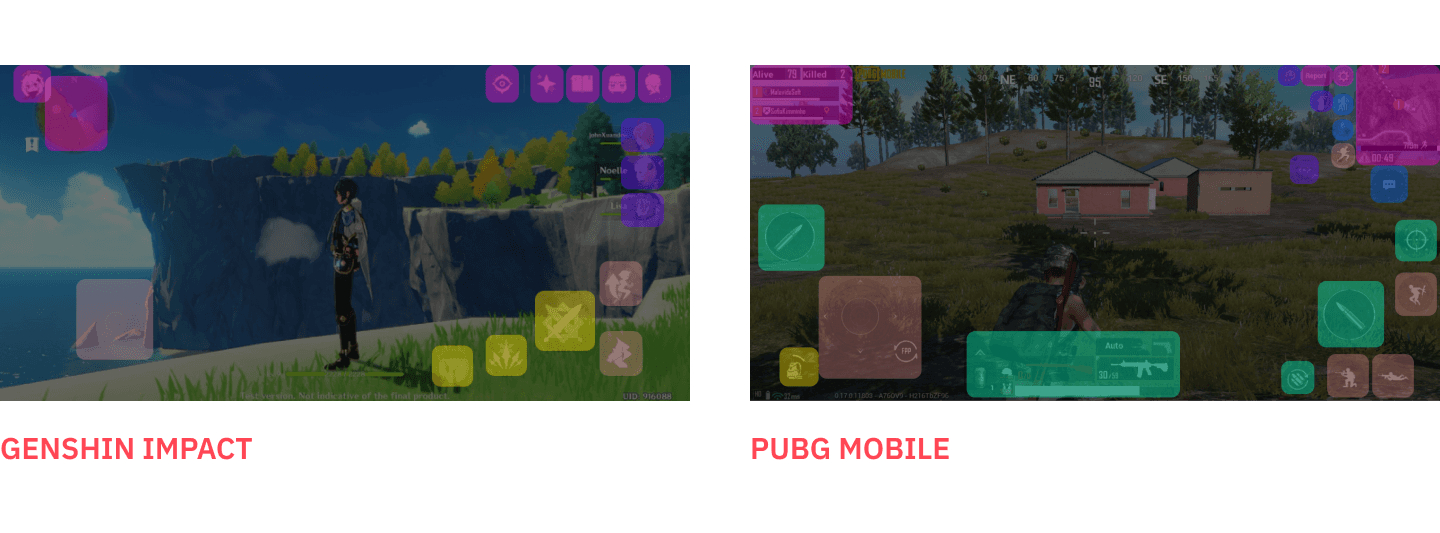
Games like Genshin Impact, PUBG Mobile, and Wild Rift place visual elements such as system status and settings buttons towards the top of the screen, and attack and move buttons near the bottom corners.
Creating initial prototypes
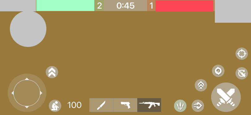
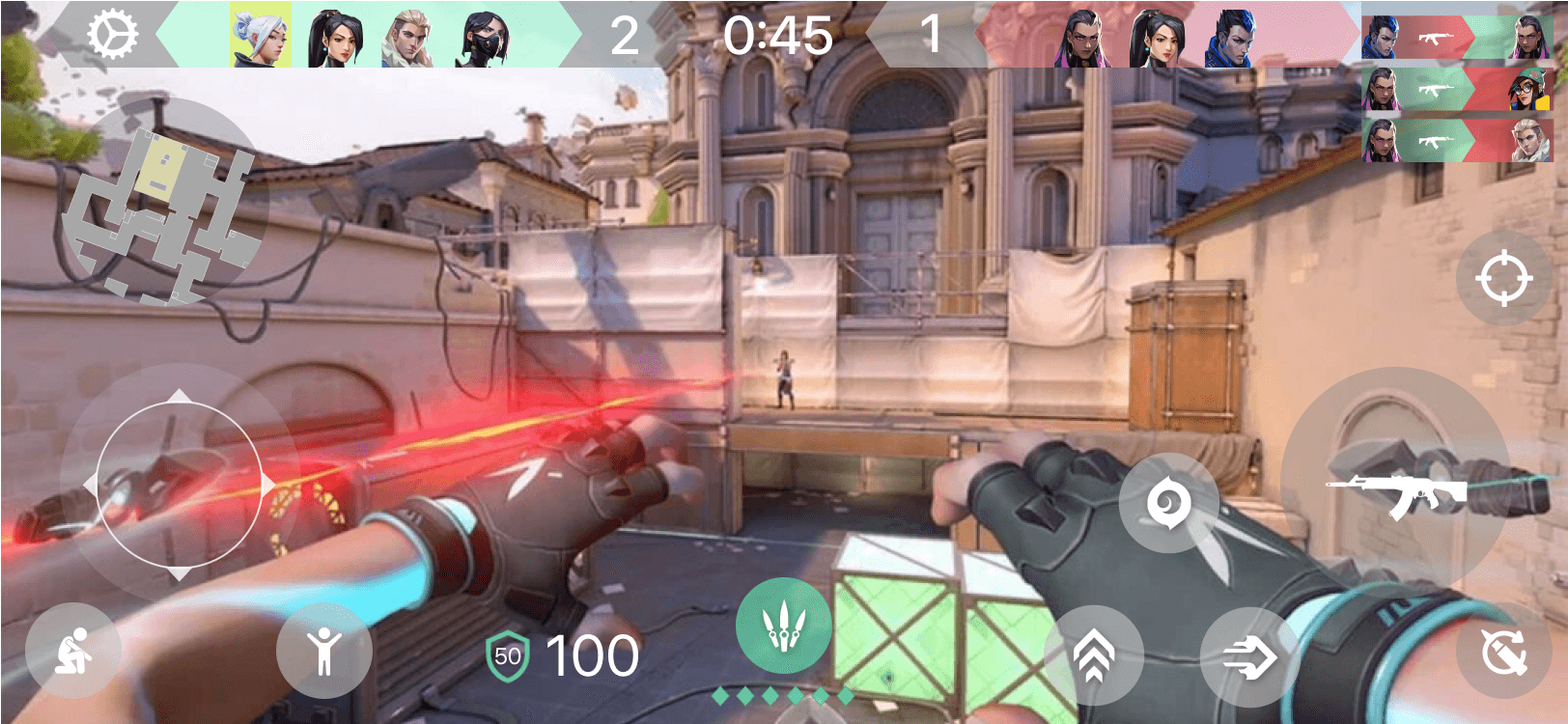
I mocked up a quick prototype to do some field testing. While I knew that the arc thumb range was the most natural, I wasn’t sure about button size or the legibility of visual elements.
Initial intended space & feature distribution on mobile
Unsurprisingly, there are a lot of tradeoffs that need to be made when designing a game for a mobile screen:
everyone's different
While the overall grip style was consistent, users had varying phone and thumb sizes. To optimize for edge cases, it’s most likely better to design for larger thumb sizes on smaller screens.
fitts' law
While bigger, closer targets are easier to hit than smaller, more distanced targets, it’s probably best to deliberately ensure an extent of difficulty to reach given the game context where misclicking can cost you greatly.
thumbS UP
Thumbs more naturally rest near the middle of the screen when held horizontally; the buttons for moving and shooting should therefore be higher up.
© 2024 Ava Liao
