Great designers steal:* successful UX patterns across AAA & indie games
*or, more accurately: avoid reinventing the wheel; stand on the shoulders of giants; reuse.
the mission.
If you’ve ever heard about UX but aren’t quite sure what it is and how it might fit with your existing processes in game development, this is for you.
We’re going to be pulling off a bit of a heist. Just for this talk, we’re all going to be art—or more appropriately, design—thieves.
So like any good heist, we need a plan.
A good heist crew needs to know the stakes first:
What’s in it for us? What even is UX? What’s the point of good UX?
We need to scope out the targets:
Where and how do you find examples of good UX?
And lastly but definitely not least, we’ll execute the operation.
I’ll cover three core UX concepts with case studies and identify what makes each so effective. It’s probably easier than you think to break these patterns down and implement them into your own games and projects.
the stakes.
User experience encompasses all aspects of the player's interaction with the game. It’s not just making the UI.
Let’s talk a bit about what the day-to-day player journey might look like.

If we know that it ends with them concluding their play session, what would you say it starts with?
Maybe it’s launching the game.
I’d actually place game launch into the third phase and I’ll explain why.
The player’s experience starts before the player begins playing the game.
It might start with them thinking about wanting to play something, then turning on their PC or console or phone, plugging in their earbuds or turning on their speakers, and then launching.

The player’s physical environment is oftentimes just as important to consider as their digital environment.
So what does the holistic view of this journey look like once the player has thought about starting, set everything up, and launched?

The vast majority of what actually takes place in-game is in this arrow. It’s up to you to make that arrow extend as short or as long as you want it to.
You don’t have to be a UX designer to think like a UX designer. In fact, it’s incredibly similar to—if not heavily overlapping with—game design.
I’m sure you can think of a time where you’ve played a game and felt frustrated.
Perhaps you haven’t played a game in a long while and you’ve completely forgotten what certain icons mean.
Or maybe there was a menu or inventory that you had to frequently access, but it took an annoying number of clicks to get there.
If you’ve ever played a Souls-like game, imagine the run back to the boss taking up half the map. You definitely want to avoid experiences like that.
All of these little things add up. The more of these little obstacles you encounter, the more likely it is that you quit out of the game earlier. Death by a thousand papercuts is a real problem, and one to be very cautious of.
Ultimately, good game UX:
makes the game more fun for the player, by
making it easier for them to access the things they need
and keeping them in the flow they want.
Now that we have a better idea of the stakes, let’s talk about the targets. Where do you find examples of successful game UX?
the targets.
Let’s start by working backwards.
If, for example, you’re looking to create a successful onboarding experience, think about what kind of incentives are at play.
Think about business motivations more broadly. What kind of games rely on high adoptability?
Free-to-play games, gachas and mobile games need to be easy to get into, and the only way to get that is if people make it through the first time user experience.
They’ve spent a lot of money on UX research and analysis to ensure that the onboarding process is as smooth as possible. There’s a reason why there are a certain number of steps, or certain elements. You can reverse-engineer these for free.
Alternatively, if you want an optimised heads-up display, it’s worth looking at fast-paced multiplayer games with a large user base. What elements do they prioritise? Why did they make some areas more flashy than others?
It’s important to look for a specific part of a game.
Make sure you’re referencing specific decisions, rather than just copy-pasting the entirety of the UI.
You don’t have to agree with their choices, but it’s definitely worth thinking about why they are that way.
This also makes UX patterns more adaptable to your specific situation.
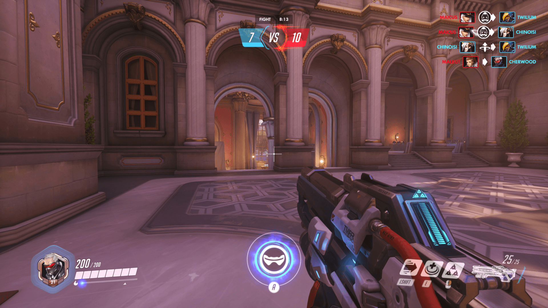
Rather than
“Overwatch has a flashing ult animation so I should have one too!”
consider instead
“Overwatch has a flashing ult animation because ults are incredibly important and have significant consequences to core gameplay. Is there an element on my screen that needs that level of attention, and if so, what? What core elements of my gameplay are important and should be represented as such in my HUD?”
Let’s get to the juicy stuff: the operation.
the operation.
We’re going to look at three core UX principles: cognitive load, pathfinding, and immersion, and I’ll walk you through why they’re so effective.
Obviously there are more than three great UX principles you should follow. I’ll have links to more resources at the end.
*
Let’s start with cognitive load.
In 1956, cognitive psychologist George Miller (not to be confused with the eponymous director of the Mad Max franchise) introduced the concept of limited short-term memory and chunking.
Miller’s Law posits that the average person is actually “severely limited in terms of the amount of information they can receive, process, and remember.”
Miller refines this limitation down to a specific number: 7 items, give or take 2.
It’s been 68 years since Miller’s research, and the sheer amount of information and stimuli that surrounds us day to day has increased exponentially.
As such, it may be better to err on the side of 5 rather than 9.
This also helps substantially when dealing with cognitive load. Things like flashy colours, unusual fonts and text treatments add to cognitive load, and make it much more difficult to know what’s going on or what you should be focusing on.
So what patterns successfully spread and reduce cognitive load?
In Apex Legends, new gameplay elements are introduced to you in a way that’s staggered.
Right from the start, there are only three items on screen.
Notice how there are only five actions you’re expected to perform before you can move on—move, sprint, jump, slide, crouch. All very basic.
Apex also chunks, or groups, which actions you’re exposed to at a time.
This establishes a tangible relationship between action and location—for example, I would be more likely to press these buttons when I’m near a crate as opposed to just running around.
Let’s also talk about Ghost of Tsushima, which has a relatively minimal HUD.
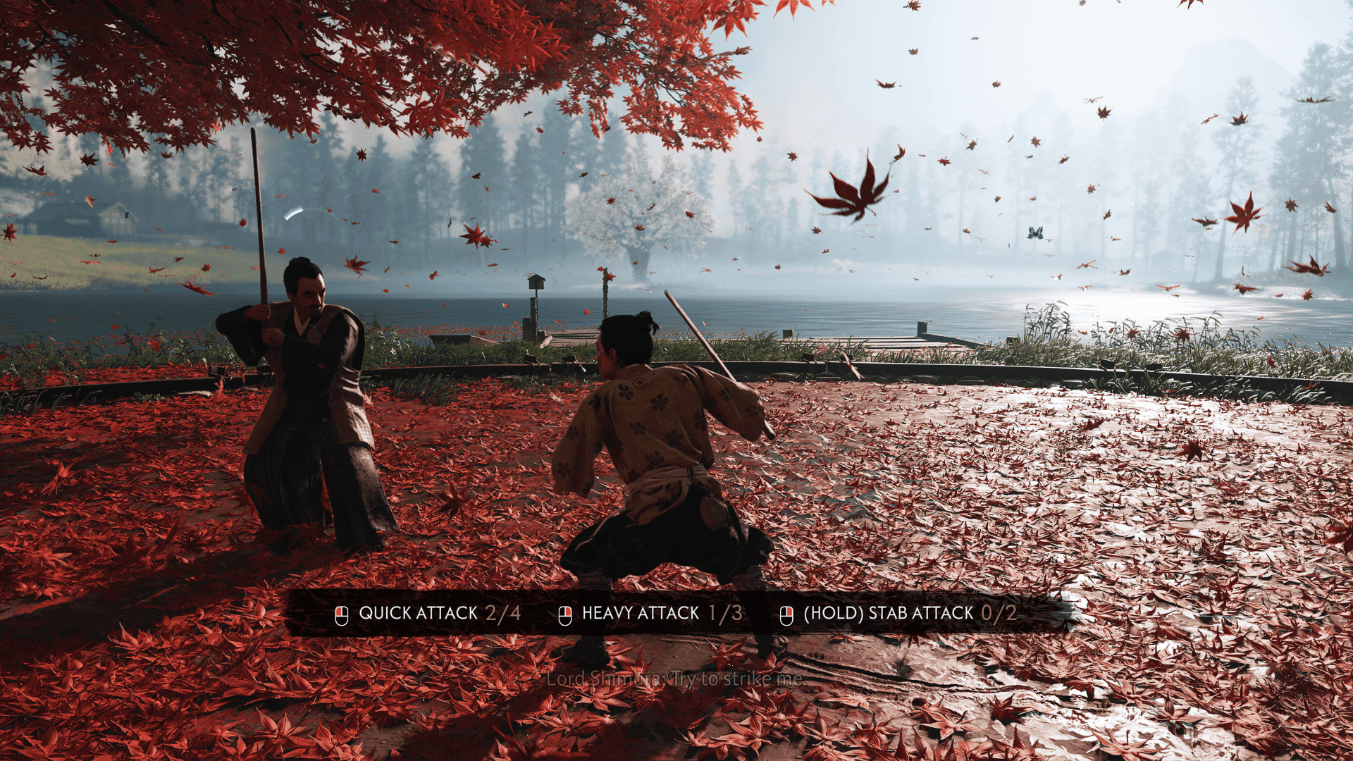
Here, you’re only presented with three actions. They’re also all grouped together so it’s relatively easy to scan at a glance. Ghost of Tsushima also goes the extra mile by adding a black background so the text is more easily readable.
There’s also reinforcement: you’re expected to repeat the action a certain number of times before you proceed.
Just like how writing notes has been proven to be more effective during learning, requiring repetition as part of onboarding helps instil muscle memory that may prove to reduce the cognitive load.
Journey—well known for its lack of any overt interface—does something similar, prompting you with an overlay of your controller when teaching you a certain action.
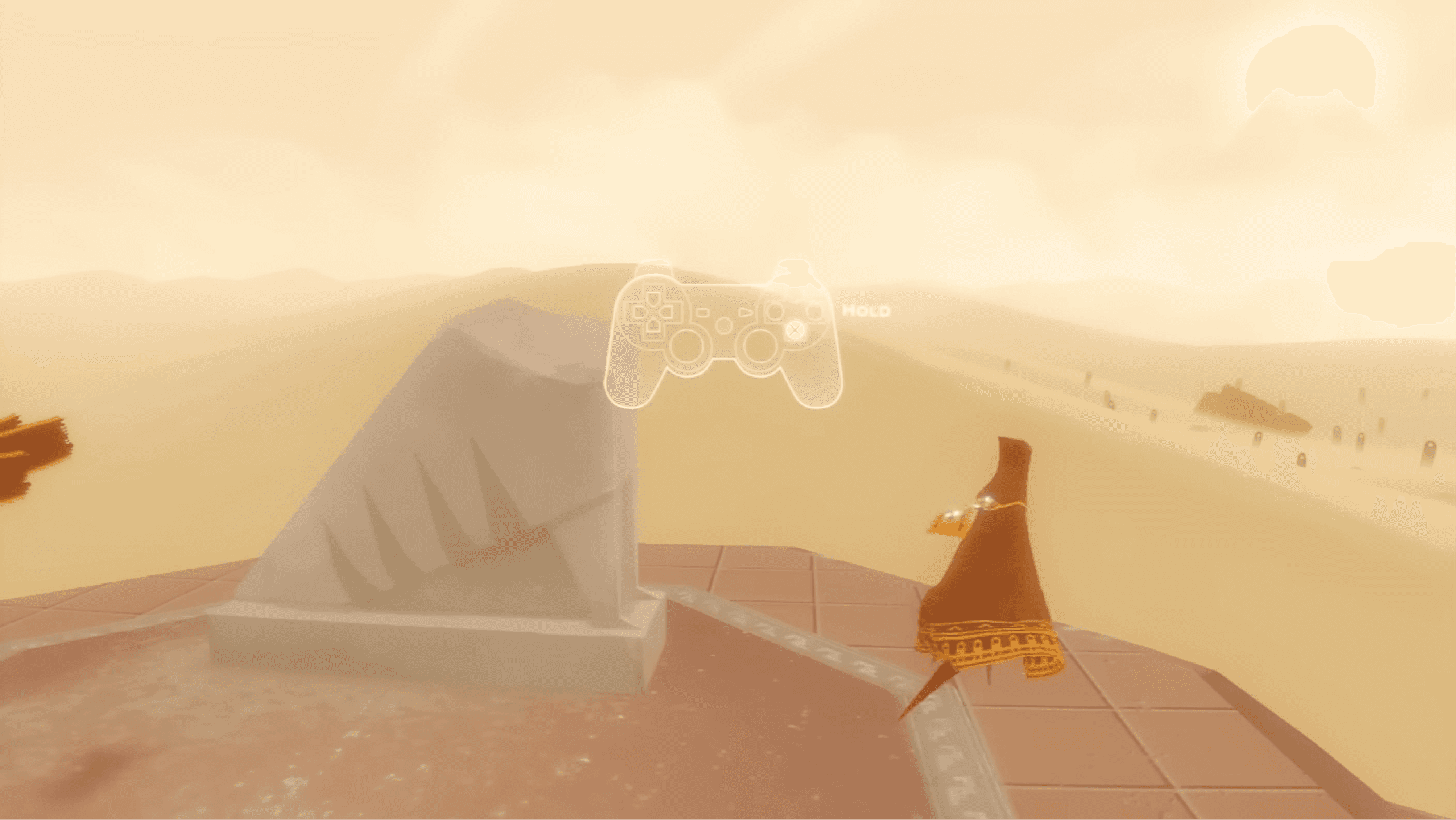
This prompt returns at different points during early gameplay, so that you gain an intuitive understanding of when best to use it.

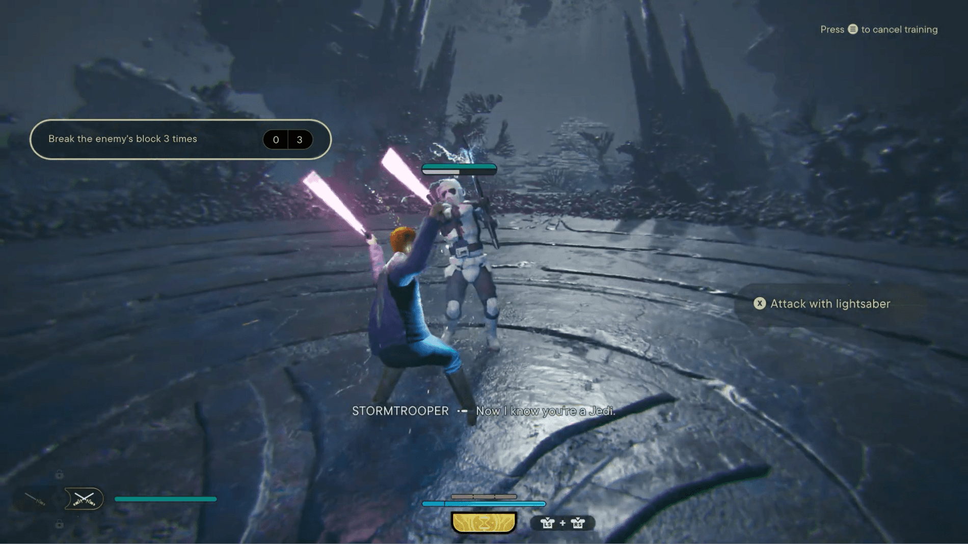
Lastly, let’s take a look at Star Wars: Jedi Survivor, which combines all of these concepts.
Again, only three items.
We only see a limited number of actions (Attack with lightsaber, Press to use Force Attack), as well as forced repetition, and easily visible text. The cherry on top here is the visual feedback when you successfully complete each action.
Jedi: Survivor takes this even further by having a training ground accessible from the menu present at any meditation point.
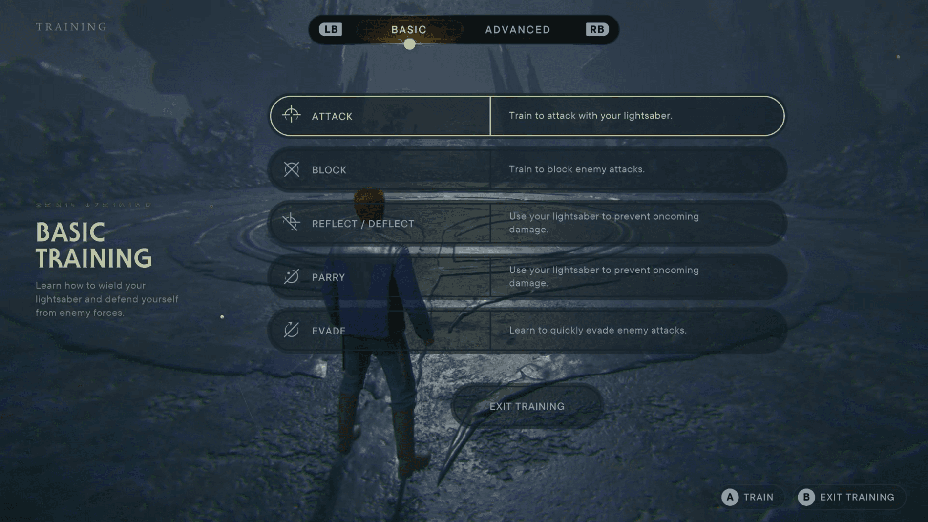
Say, for example, you quit out and you don’t play for a month. When you’re back, you’ll be able to access this area to refresh your memory to feel less disoriented before returning to regular gameplay.
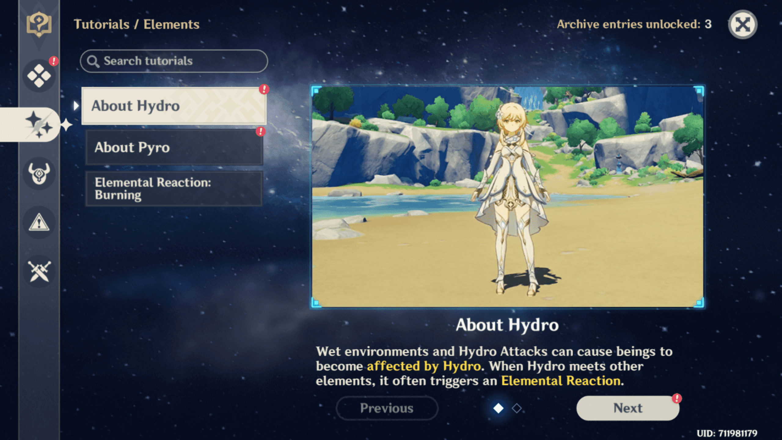
Genshin Impact also does something similar with its Tutorial and archive hub, where you can also search up not only core combat actions but also gameplay and puzzle mechanics.
To recap this first idea, be mindful of cognitive load:
Stagger new concepts and group them in ways that will make it easy for the player to remember.
Reinforce these new concepts through repetition and reminders.
Make sure that there’s no more than five, or at a stretch, seven items on screen at a time.
If you can, give players a place where they can refer back to these concepts, or practice in a safe area. If you accidentally skipped through something, it’s good to know that there’s somewhere you can catch up.
*
Next, let’s talk about pathfinding.
How easy is it for your player to get to the thing they need, and do they know what to look for in the first place?
Think of pathfinding like level design, but for your interface. Sometimes players need that yellow paint to not only know where to go next but as a distinct indicator of what to look for.
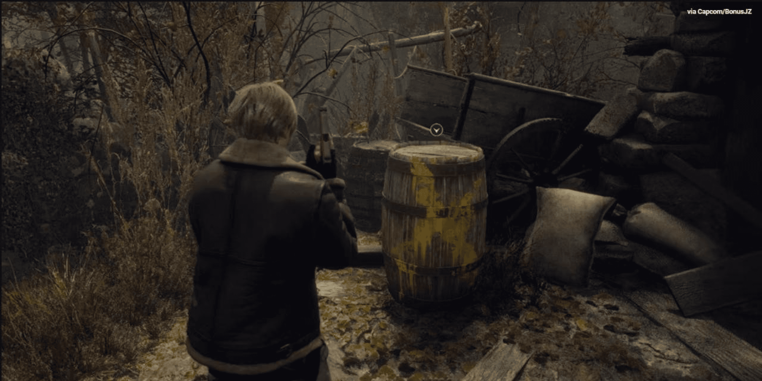
It’s always good practice to block it out first (as rough sketches, or ugly grey boxes just like real level designers), and then gradually add layers of fidelity.
What do you think Disco Elysium, the League of Legends client, and Genshin Impact all have in common?
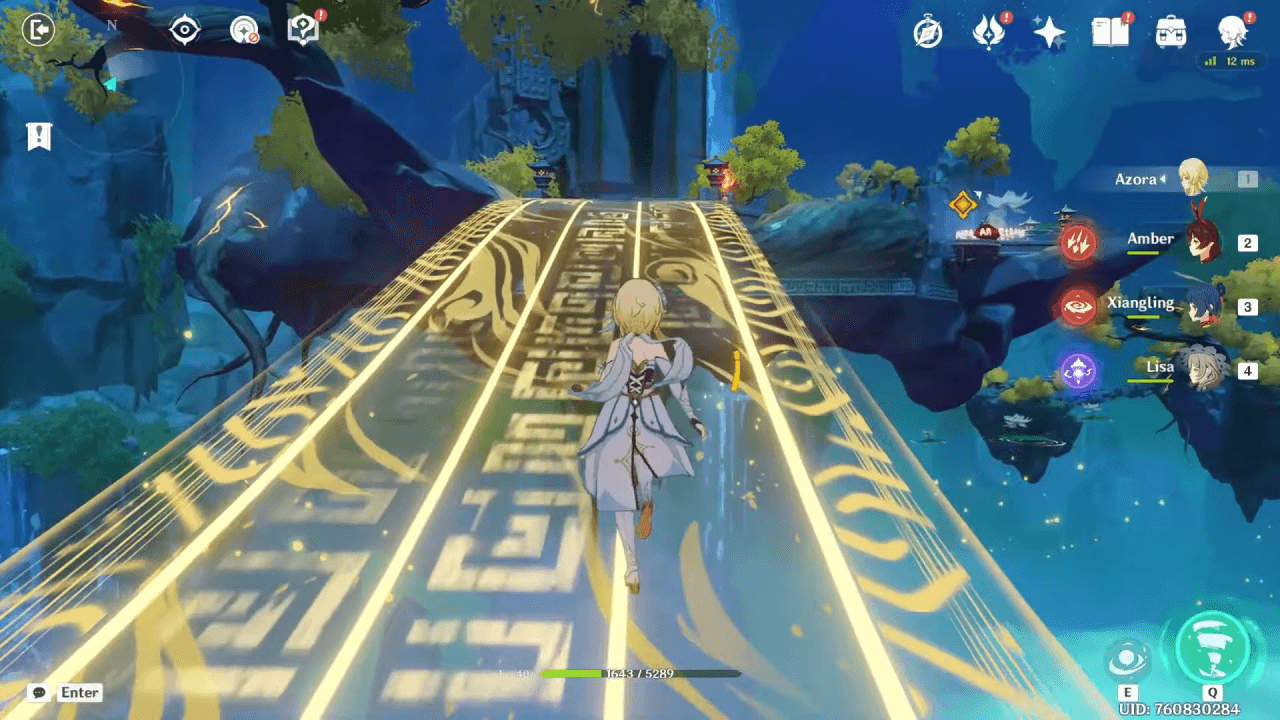
They all make use of notification badges.
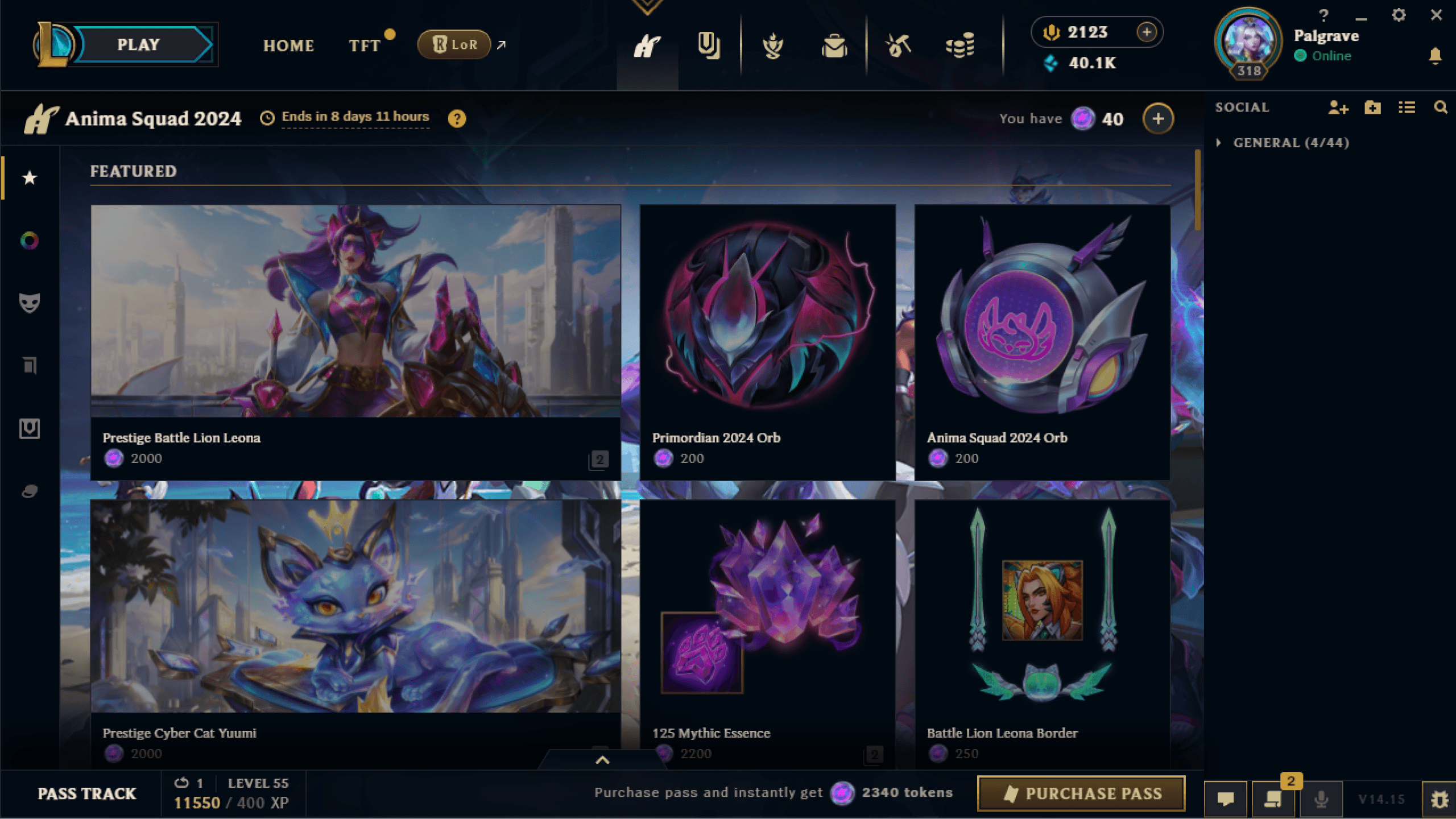
It’s a tried and tested pathfinding pattern across software; introducing it into your game as a way to signify something new, whether that’s a newly acquired inventory item or some kind of change in the background is a surefire way of attracting the player’s attention.

Maybe you’re locked into your current game activity and don’t have time to respond to whatever’s going on. Notification badges serve as a clear flag of where to go next.
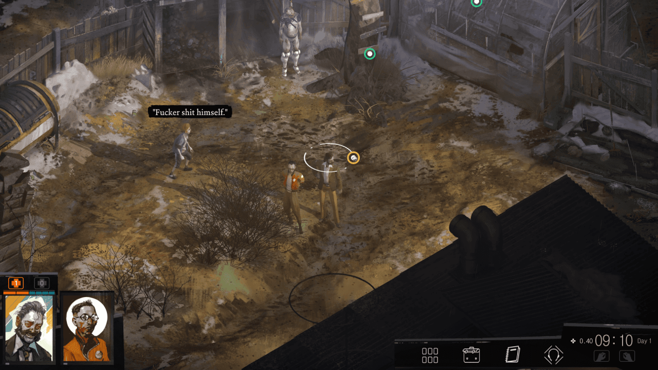
Disco Elysium takes this a bit further; the little halo surrounding Harry’s head throughout the game when you enter Detective Mode highlights all interactible objects with these little green orbs as a way to nudge the player in the right direction. It’s important to note that this mode can be toggled on or off to preserve immersion.
Destiny 2 gives us another way of directing the player’s attention, with accented underlined hints.
It also makes use of the Gestalt principles of proximity and similarity to establish hierarchy.
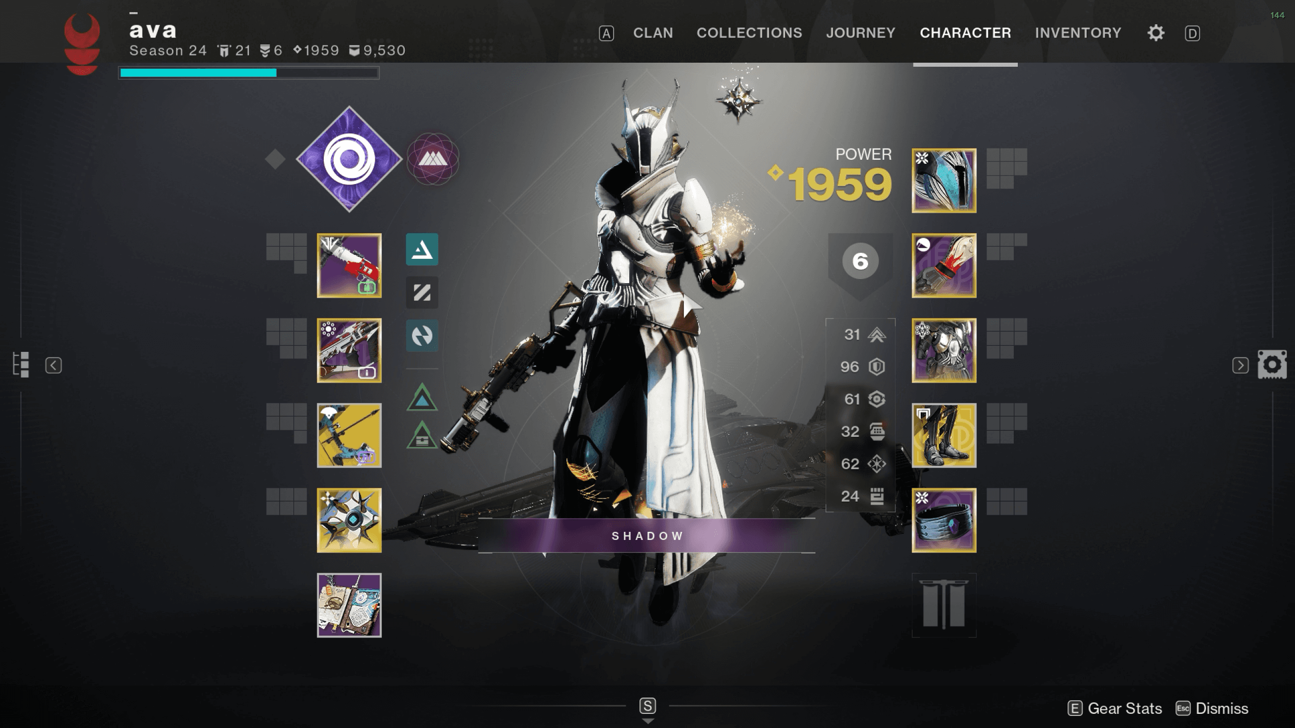
In this character inspection screen, I can tell at a glance which sub-menu I’m in since they’re all grouped together on the top right.

I also know how to navigate from Character to Journey thanks to the key symbols on the far left and right of the header, A and D.
There’s also other smaller, more subtle hints with the navigation; you can see on the left and the right of the screen there are icons representing Journey and Inventory also.
Let’s also talk about pathfinding within the HUD.
Are the elements that you’re going to be interacting with the most in positions that make sense?
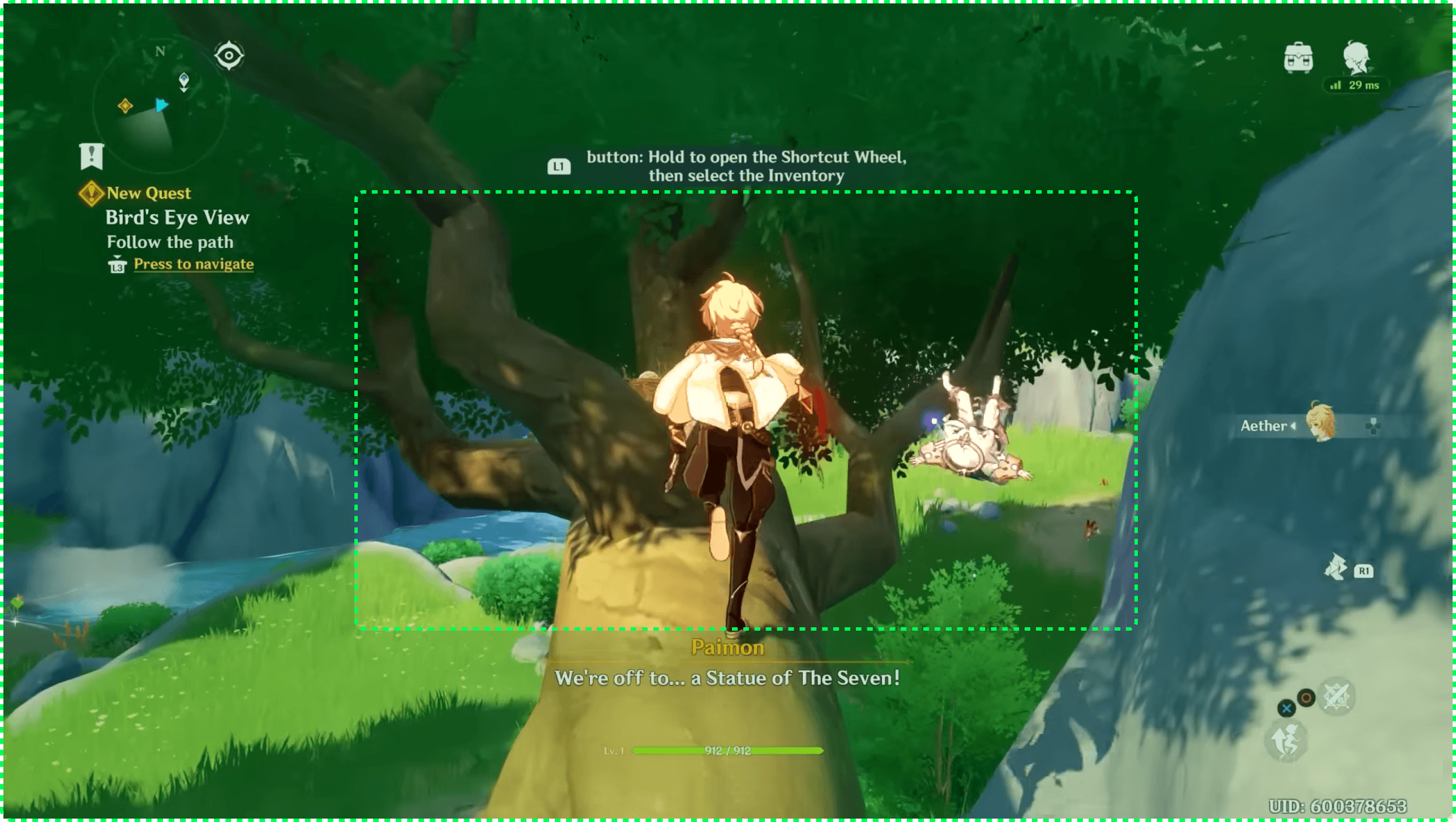
You’ll probably already have noticed that most HUDs and interfaces in general focus their core elements around the corners and edges of the screen, rather than taking up the centre.
It’s obvious why—you don’t want to obstruct the actual gameplay and what’s going on, but let’s also think about the relative positioning.
How far does the player’s cursor, mouse, or hand have to travel to get to each on-screen element?
The further it needs to go, the more friction there is, and the less accessible it will likely be.
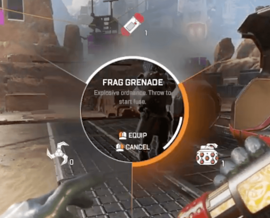
Are there perhaps shortcuts instead that could circumvent this friction entirely, like the keyboard shortcuts in Genshin Impact or the utility wheel in Apex Legends?
Darkest Dungeon is a more extreme example of HUD positioning that succeeds.
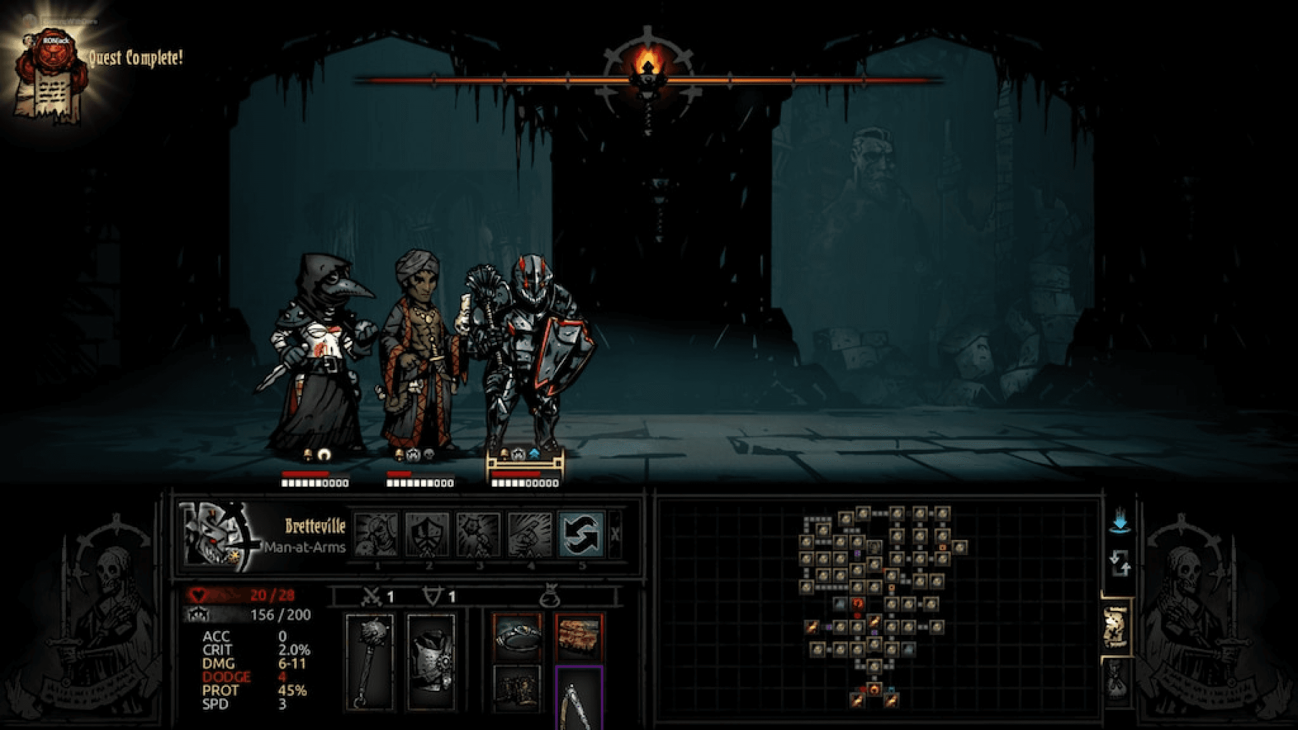
The overwhelming majority of actions and interactible elements—with the exception of the torch brightness—are in the bottom half of the screen.

Even if you haven’t played the game, you can tell from a glance that the macro element—that is, map location—is on the right half, while the more micro elements—individual character actions and stats—are on the left half.
Your brain can then make the deduction that most of your playtime will be spent focusing on the left half, where everything is conveniently grouped.
Your mouse doesn’t have to move across the entire screen to reach the next most reasonable action or button: it saves you time and keeps you in the flow.
Let’s quickly recap pathfinding:
Treat interface design similarly to level design. Add indicators or accents when needed to emphasise key state changes or to draw attention.
Group relevant actions together to minimise friction.
Consider the value of shortcuts as a faster and more accessible alternative.
Clicking on notifications should take you directly to the relevant screen.
Lastly, I’d like to talk a little bit about immersion and the potential of diegetic interfaces.
The point of this isn’t to tell you that you should be adding more interfaces into your games; great UX doesn’t necessarily mean more UI.
You’ve probably seen this meme floating around at some point:
Rather, the point is to encourage you to think about what your game and your players might need.
Unpacking does a great job at this.
Instead of adding an item counter or checklist to the interface while the player’s unpacking, they focus on subtractive design—in which all extraneous elements are removed to “strengthen the core.”
This game could also have added those red outlines during the process of placing, but instead the game preserves your flow.
The only indicators that you need to change something are left until you’ve completely removed everything from the packing boxes.
There’s also a cheat code: the aesthetic-usability effect means that if the interface is more aesthetically pleasing, then people think of it as more usable, even if it’s technically not.
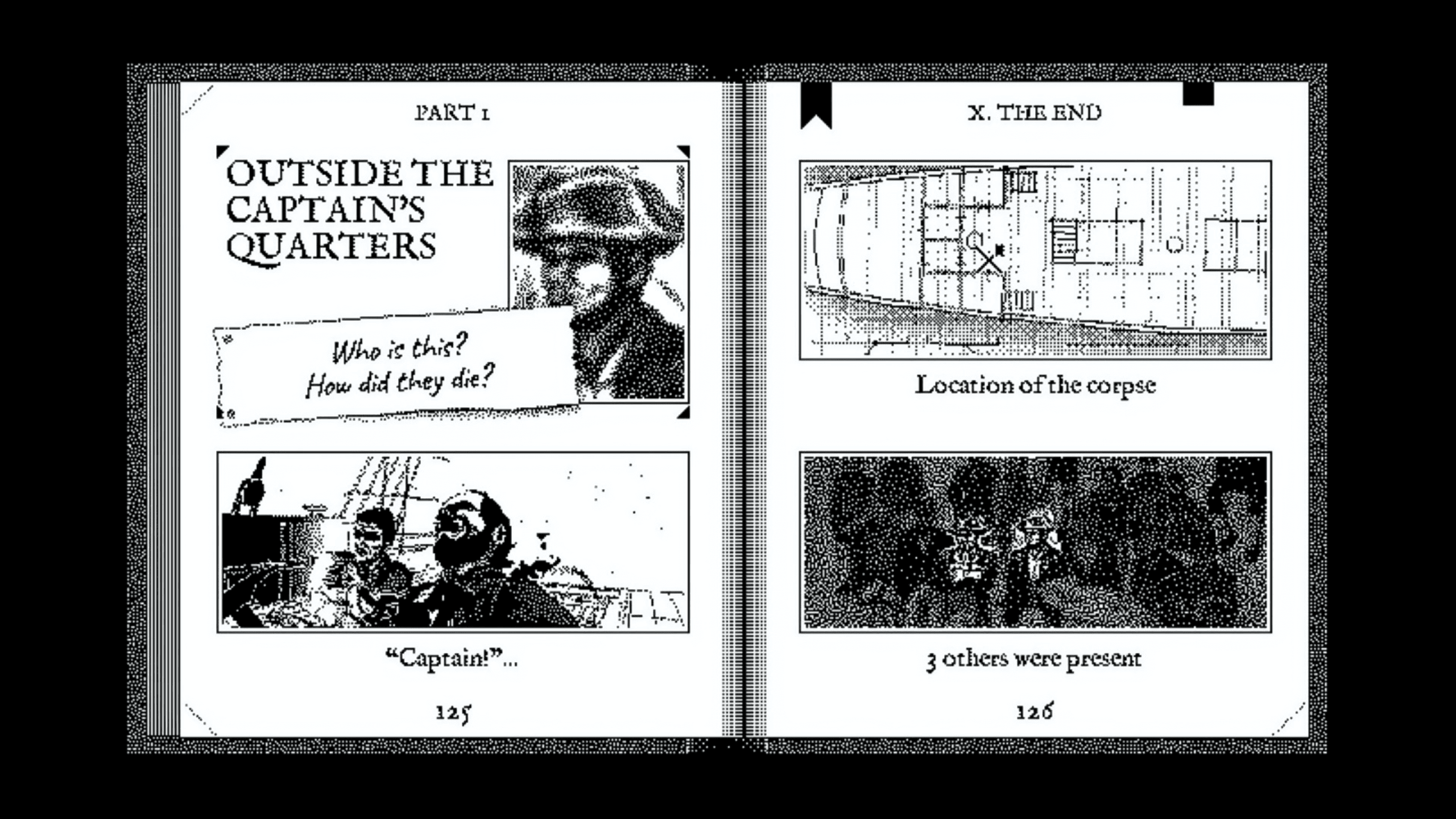
A good way to do this is by bringing narrative or worldbuilding into the interface if possible, making it diegetic.
Perhaps text prompts and notifications are styled in the likeness of the government documents of that game’s world.
Maybe they’re gigantic stone slabs etched with ancient Jedi runes.
Maybe it’s a ship log being used by an investigator.
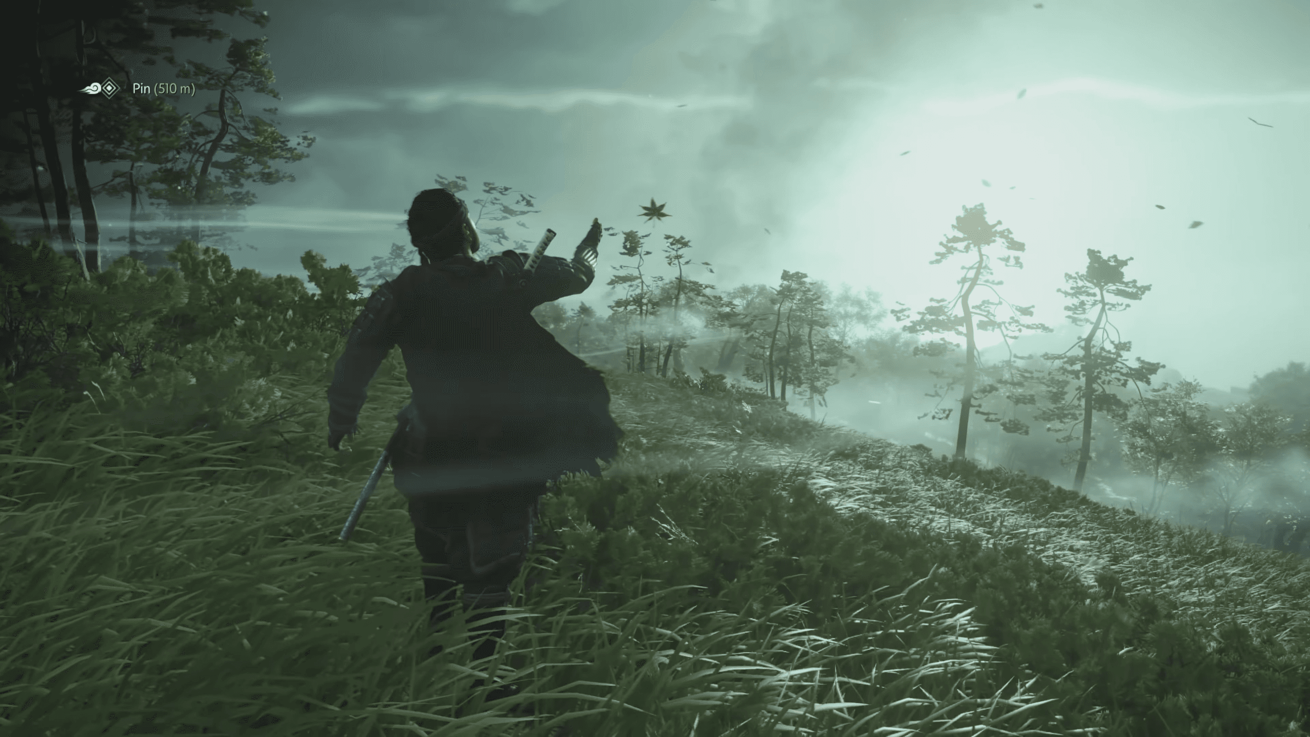
Or maybe they’re not even interfaces at all. Maybe it’s something like the guiding wind in Ghost of Tsushima. The sky really is the limit here.
the debrief.
We’ve covered a lot in the last few sections, but what’s incredibly important above anything I’ve mentioned so far is testing.
Your UX is only good if you can prove if it’s good.
Don’t underestimate the power of cheap and fast prototyping—”faking it” using grey boxes in Figma can yield more insights and save more money than a fully-built in-engine render.
Make sure to go out there and test on strangers, not just your friends and family.
So now with all those covered, I’d like to say that this mission is complete.
Good UX doesn’t have to be costly, difficult, or full of UI; it’s more than possible to learn from these successful patterns you see in other games and integrate them into your own.
Thank you for reading!
credits & resources
Talks
Art Direction for AAA UI, Omer Younas, GDC 2018
Crafting an innovative and holistic art style for user interfaces, Tim Nguyen & Ian Plater, Game UX Summit 2022
The Best and Most 'Stealable' Mechanics from Tabletop RPGs, Evan Hill, GDC 2023
'Unpacking' Zen: Designing a Game Without Fail States or Scores, Wren Brier, GDC 2023
Customizing a Billion Lightsabers: 'STAR WARS Jedi: Survivor' Workbench UX, Jordan DeVries, GDC 2024
Resources
The Definition of User Experience, Don Norman and Jakob Nielsen, 1998
Interface in Game
Game UI Database, Edd Coates
Laws of UX, Jon Yablonski
Games
Control
Darkest Dungeon
Destiny 2
League of Legends client
Journey
Unpacking
Star Wars Jedi: Survivor
Disco Elysium
Ghost of Tsushima
Return of the Obra Dinn